Infragistics' core customers were developers relying on UI components for built-in functionality and performance. A pattern kept surfacing on customer calls: after all the design work, engineers were still rebuilding pages by hand from static specs. Designers wanted to deliver finished UIs using real components, not handoff documents. Any solution had to span Angular, React, Blazor, and Web Components.
I owned product strategy, roadmap, and design execution across 20 people in 4 distributed teams in Uruguay and Bulgaria, without direct authority over any of them. The developers, designers, and architects on those teams covered core UI, design system, Figma integration, and cross-platform code generation. I reported to the director of engineering and sized sprints with a development product owner. Each sprint I specced, tested, and signed off, and I also owned the customer side: sales calls, requirements capture, and roadmap decisions.
Nine months from vision to v1, with a newly assembled remote team and no shared design language yet in place. The technical constraint compounded it: enterprise stacks shift, and tying designs to any one framework would create rework the moment they did. Scope had to be cut ruthlessly to stay coherent and hit the date: the design itself had to be the stable artifact, with code generated on demand for whatever framework a team needed.
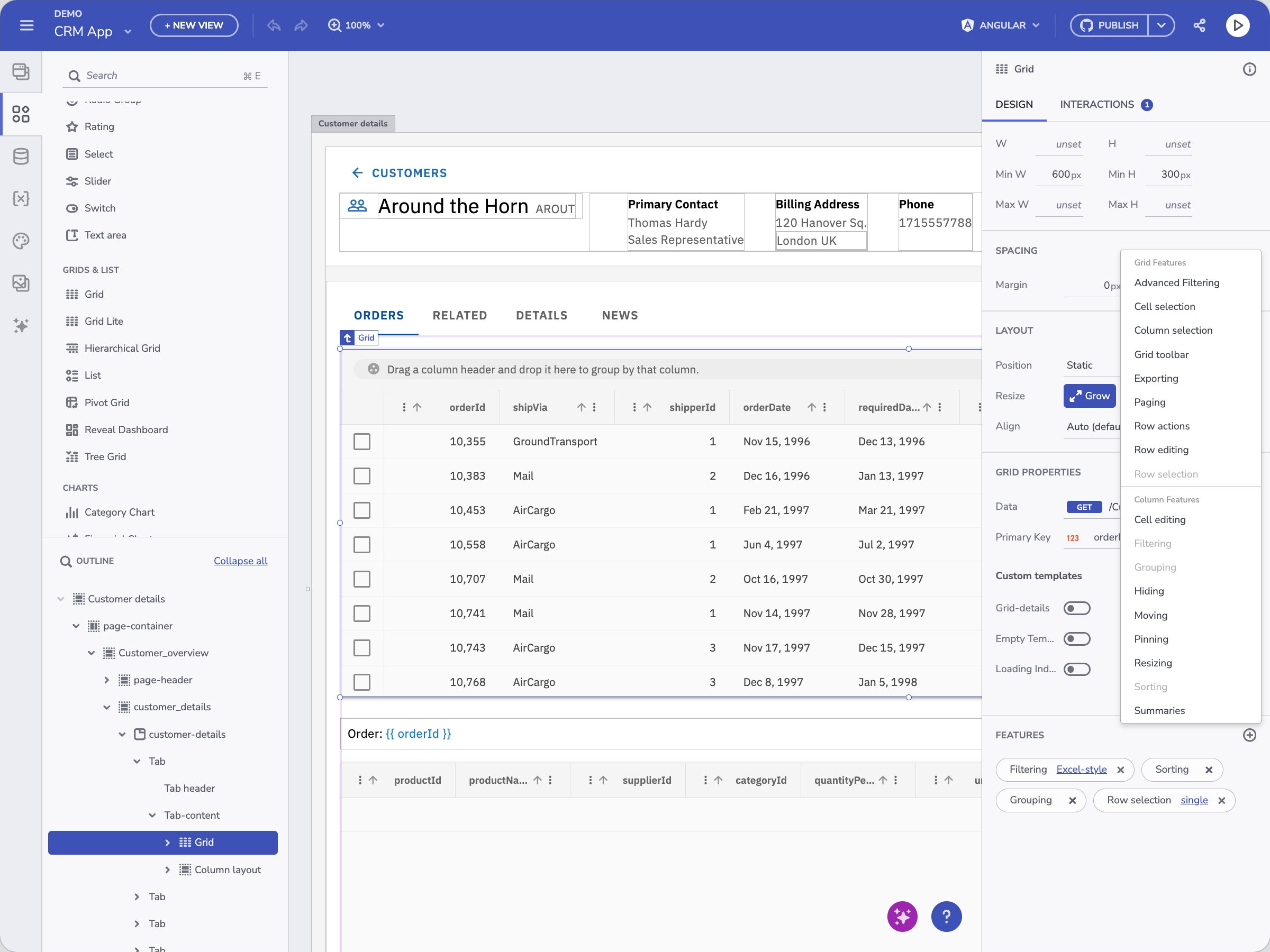
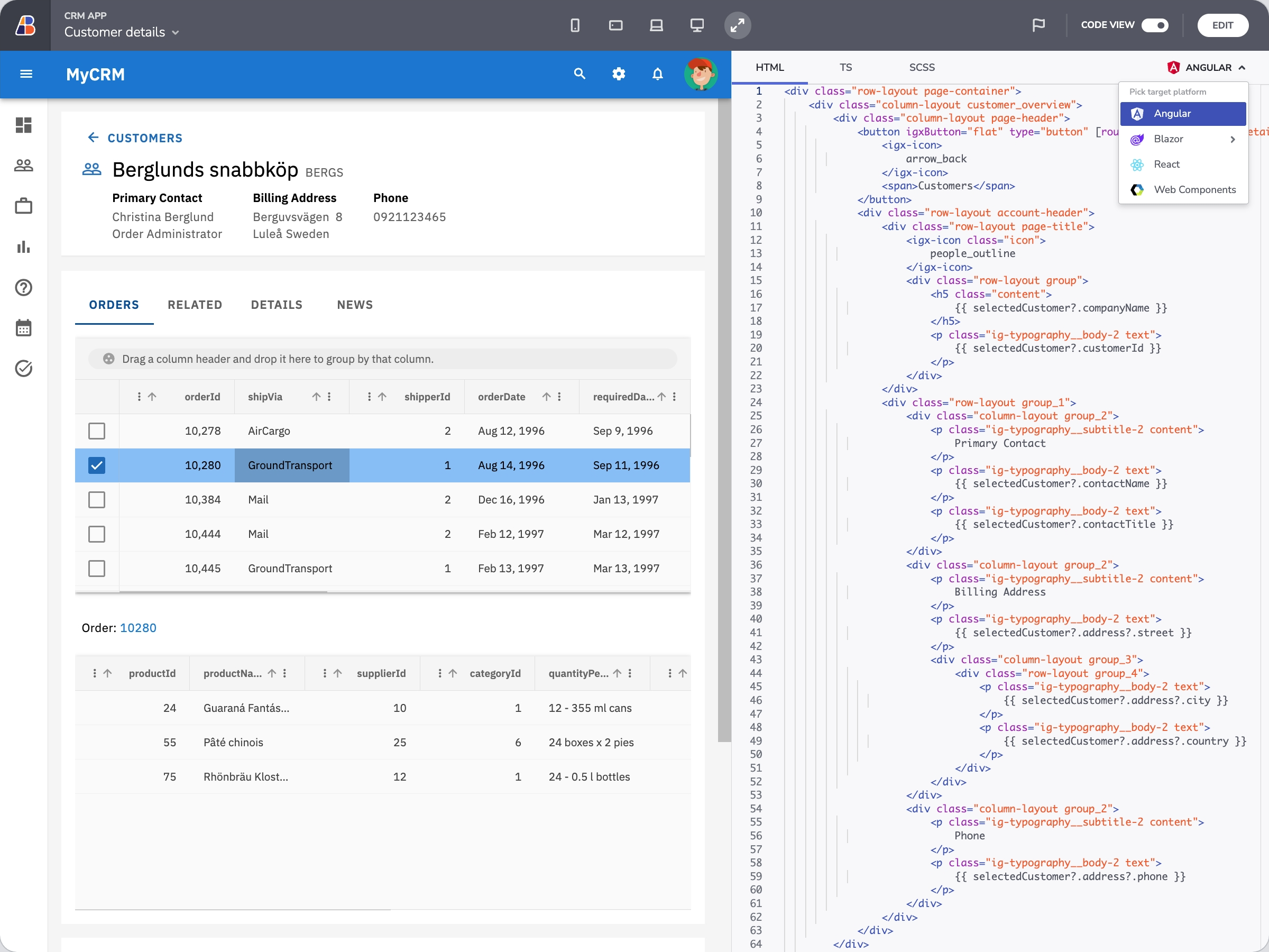
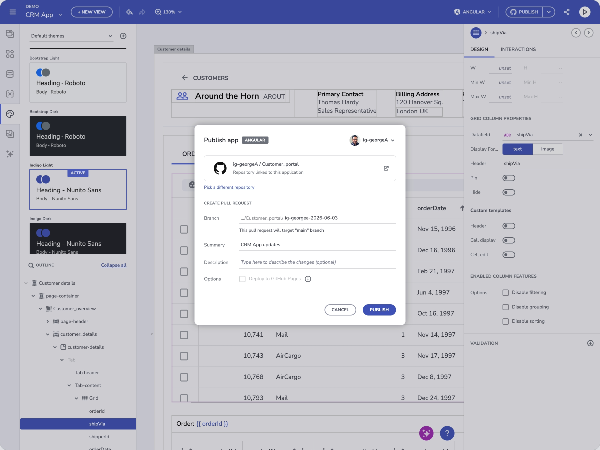
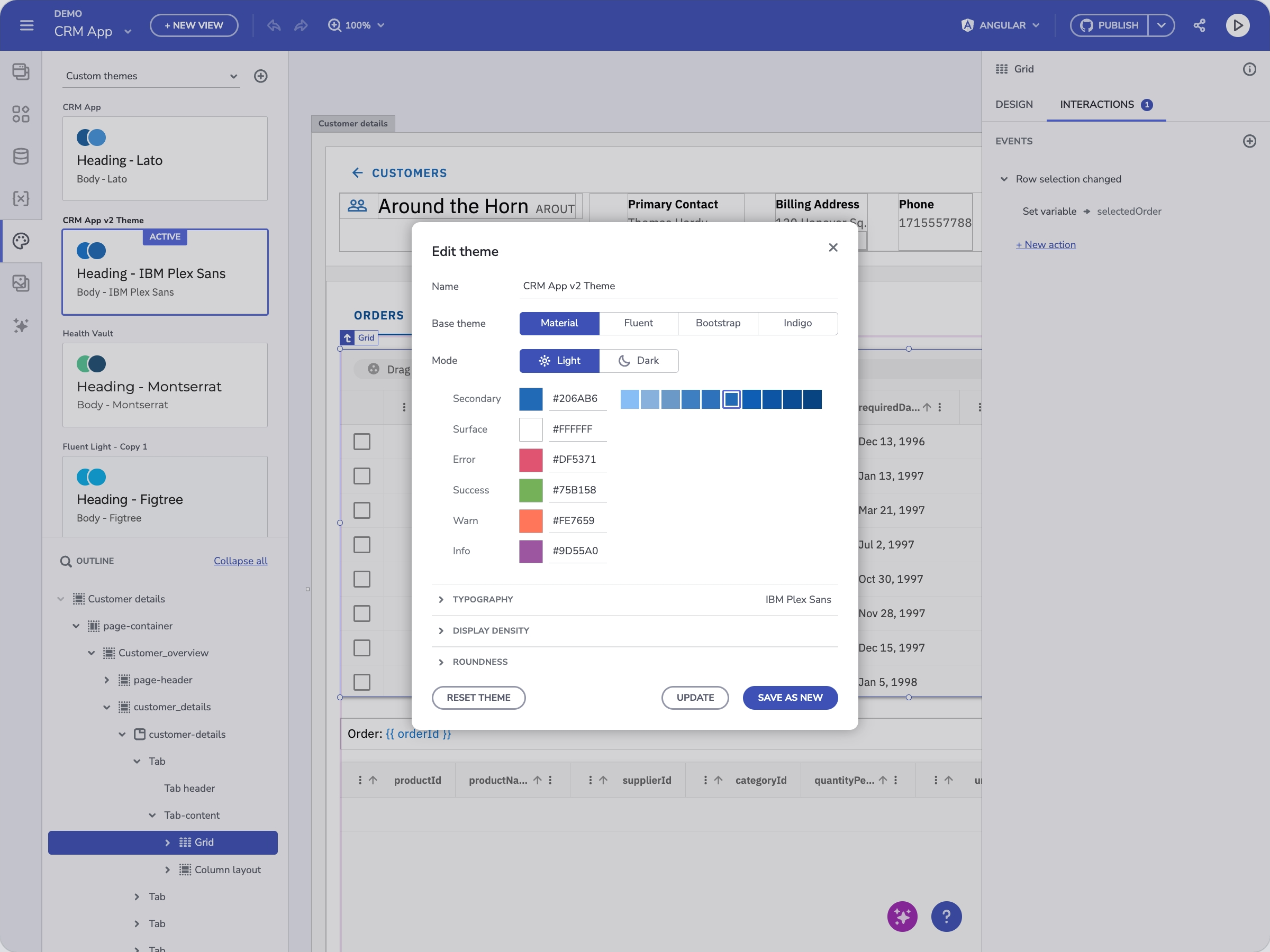
The component API was extensive, so I audited it down to the properties that mattered in a visual editor, which made it feel like a design tool instead of a developer console. Theming was scoped to CSS overrides: maintainable, readable, no platform expertise required. The output was framework-native code, not a proprietary format, so developers could extend it freely with the full API. Design tokens compiled directly into that code, which meant a wrong token produced wrong output in every framework, so design system fidelity had to be exact. GitHub and Azure DevOps integrations put the generated code straight into existing pipelines, with designers authoring the PRs themselves.
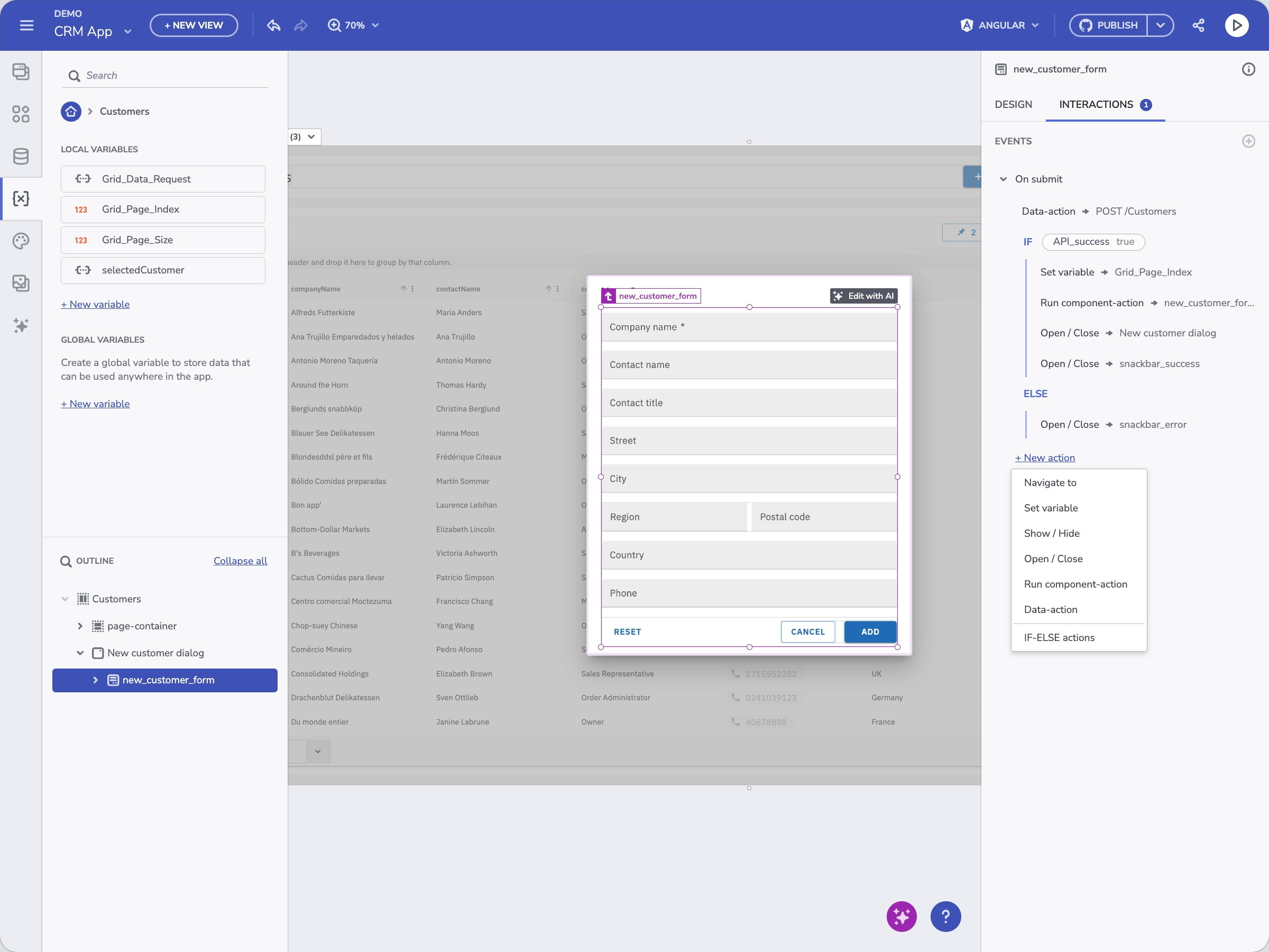
When the AI layer was added, the same constraints made it trustworthy. A component metadata layer limited the LLM to real components, so hallucinations showed up as mapping errors instead of invented UI. Visual scope became the change boundary. Testing surfaced two mental models, blank-slate generation and iteration on existing work, and each maps to a separate instruction file. Fully autonomous agents remain the open problem.
A design-to-code workspace with a shareable live preview using real REST API data: nothing stored, no privacy exposure. When ready, a PR landed in the team's existing pipeline: framework-native, production-ready code across Angular, React, Blazor, or Web Components, extendable without rework. Available as an SDK for customers who needed to embed and white-label the experience. The platform later extended with an AI-driven generation layer: natural language in, design-system-constrained layout out, feeding the same code generation pipeline downstream.